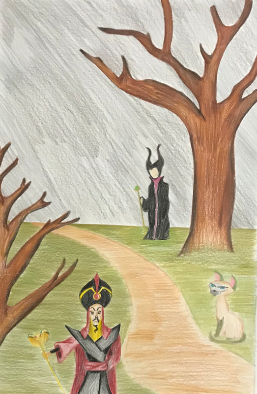
UWM Illustration
Protagonist Vs. Antagonist
|
38 cm x 50 cm
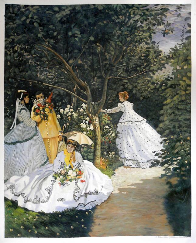
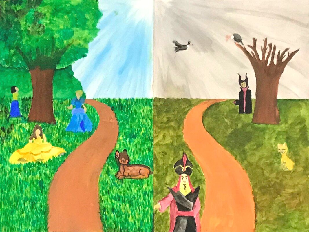
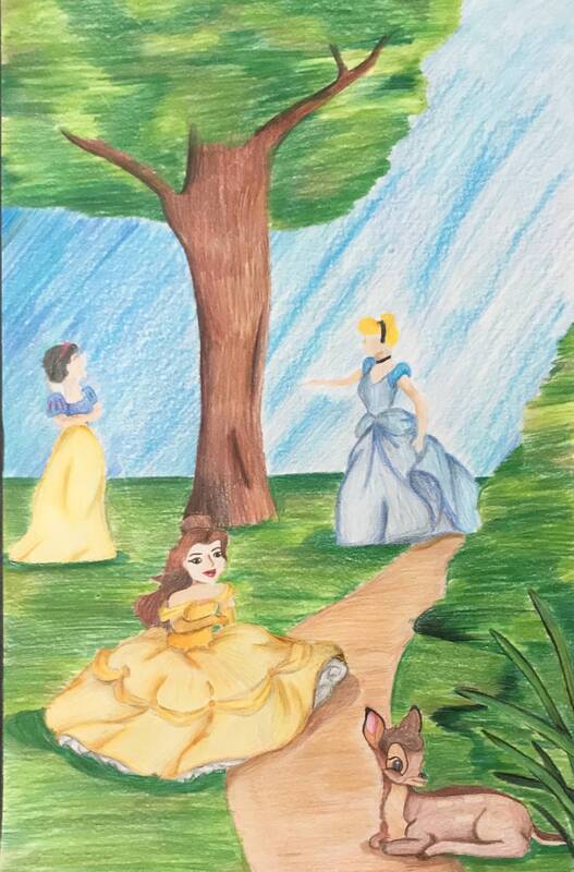
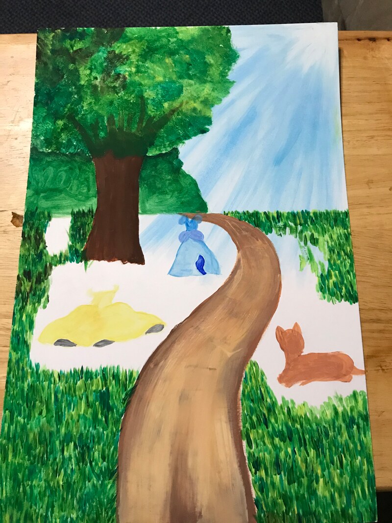
Gouache on Canvas January 14, 2020 Protagonist Vs Antagonist illustrations were in inspired by Women in the Garden by Claude Monet. This piece was created to show to opposing views, those being the protagonist and the antagonist of a story.
|
|
Inspiration
|
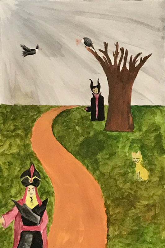
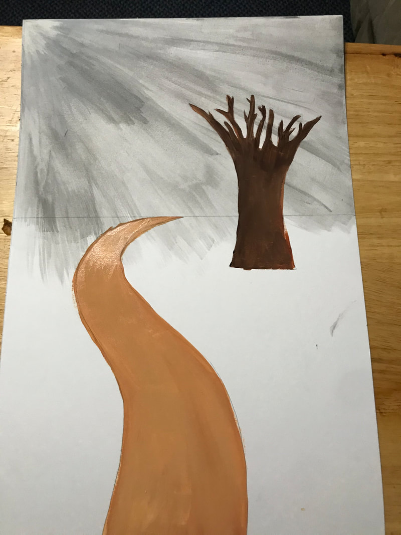
Inspiration came from two different places, the first being from Claude Monet's painting, Women in the Garden, and from old school Disney movies. I've always had a fascination towards the real life Disney stories, where the princesses never got their happily ever after, this is when I came up with the idea of the protagonist and antagonist. I looked for more inspiration through movies, and came across the movie Bambi which I used as a reference to my "old school" style. I noticed there was a thin black outline of the animals and was debating on whether to incorporate it or not. In the scenes there were softer colors used and there was less detail involved, which gave the background an abstract feel. The inspiration for the characters came from Disney. I decided to include at least one animal just to show how there are also animal protagonist. I choose 3 different princesses from Disney, and then two villains from Disney and one antagonist animal. The layout of the art pieces came from Monet's, Women in the Garden. Both the illustrations had to be connected in some way, I used Monet's painting mainly for the Protagonist side. With nature as the back ground represented beautifully, I thought it would represent the protagonists very well. I then thought about the antagonists, and said to myself, "Well if the opposite if protagonist is antagonist, the layout and the background should be the same as well." I decided to have the same layout, but flip it 180 degrees; instead of having trees full of green and a nice blue sky, I created the exact opposite, using dim colors, dead trees, and using antagonists. The techniques in both the Bambi scenes and the painting, have the background as more abstract and softer feel. In order to incorporate that detail, I decided to have the sky and anything earth wise, to have a variety of colors without blending them too much.
|
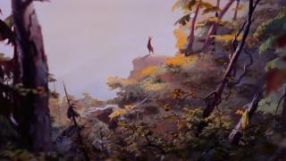
Movie scene from Bambi (Click to Enlarge)
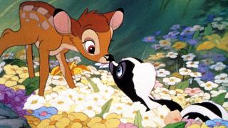
Movie scene from Bambi (Click to Enlarge)
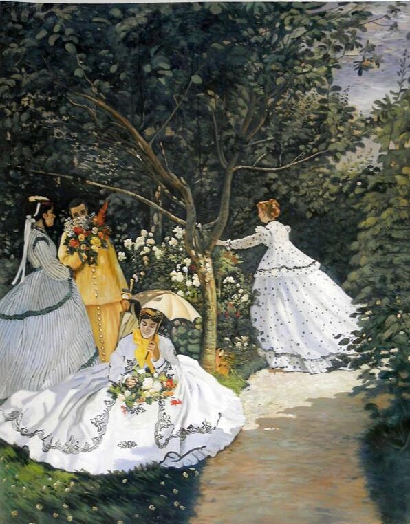
Claude Monet, Women in the Garden ( Oil on Canvas, 1866)
|
Planning
|
|
|
|
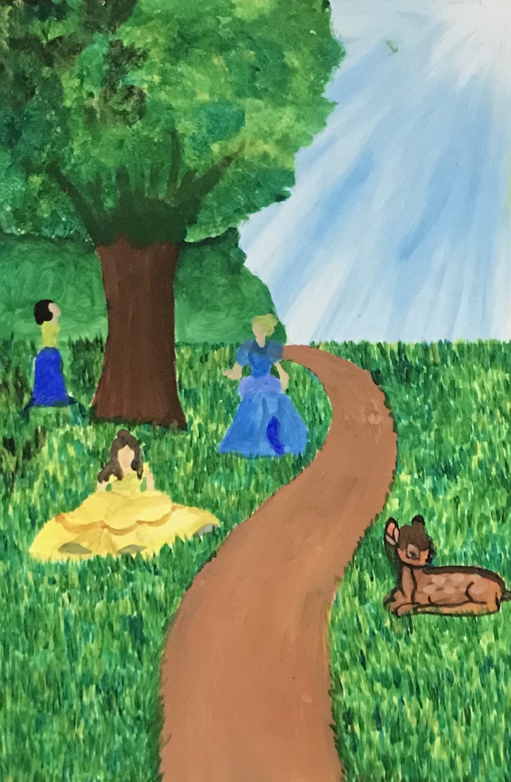
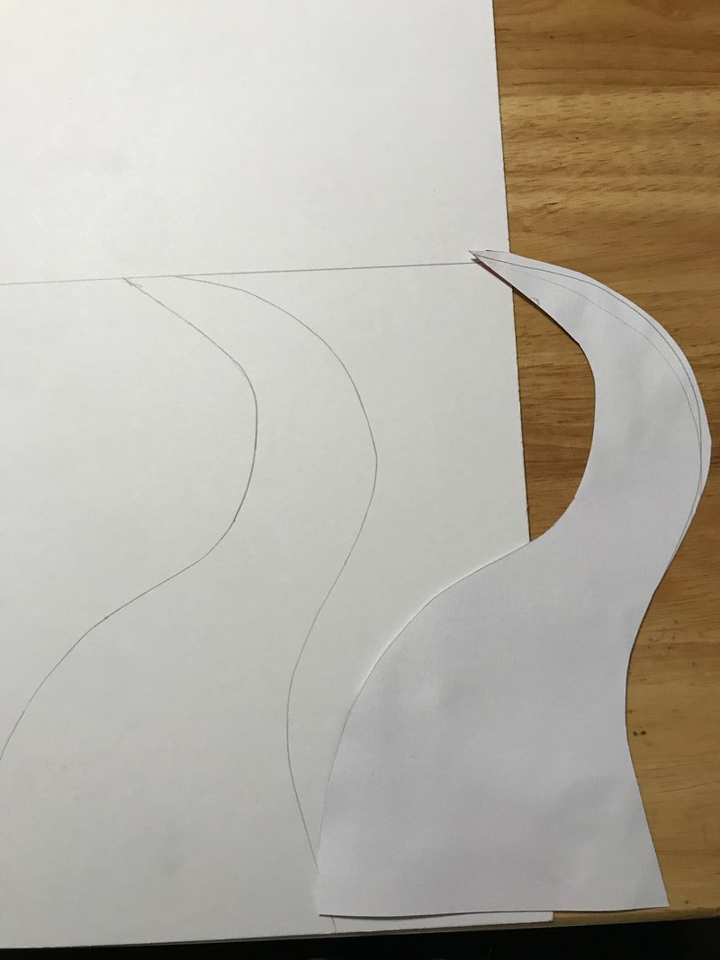
For sketches, I used the drawings from the first semester. Most of the figures and placings were kept the same, but there were small things changed. I took out all the plants from the right side (protagonist) because I believed it distracted from the rest of the work.
|
When planning I decided I wanted the artworks to be mirrored, for this I made sure they had the exact same horizon line, sidewalk, tree, and sky. I made a sketch of the side walk and tree on a piece of paper. I cut it out then made sure all measurements were correct. I did not do the same for the bush because In the antagonists side I wanted to show that it was cut down for "evil" use.
|
Process
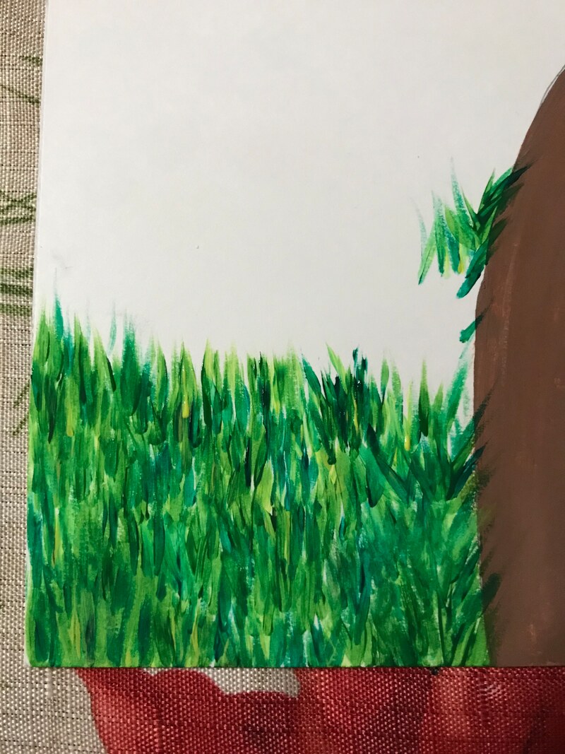
Painting grass was the most time consuming simply because each piece of grass was one stroke. I used a long rounded brush and did strokes of green, blue, and yellow. I layered the colors, as well as not clean the brush after each color. This allowed me to create different shades of green, making it look more like real grass.
|
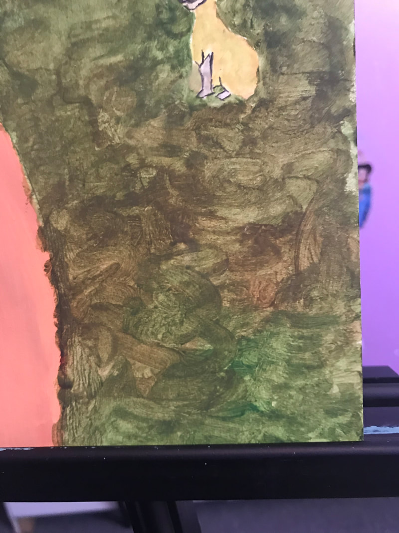
When beginning on painting the antagonist piece. I wanted the grass to seem almost dead, then I remember going to the park in fall and the grass is an almost brown, yellow, green color and I decided not to make the grass stand because during the winter or fall the grass seems flat and crushed, which is why I decided to have swirling strokes.
|
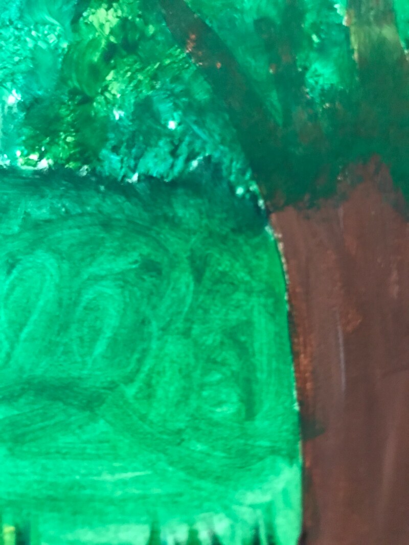
After painting the grass, I wanted to add a bush for the protagonist piece. Both the bush and the grass were going to be the same color, but in order to differentiate them, I did swirling strokes. This allowed the view to see the difference between both, while having the same colors.
|
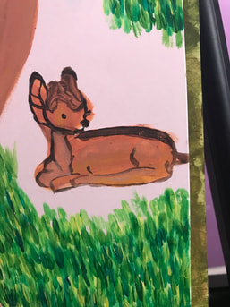
Painting Bambi was the only figure I struggled with color. Since Bambi is a deer, there were multiple shades of brown involved, when working on the detailing, the colors would end up mixing. I had to reduce the number of shades I would do and limited it to 3 different shades. This did reduce the amount of paint being mixed when working on the details.
|
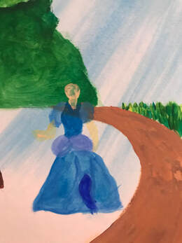
I began painting with the protagonist piece. When working on the figures, I came to realize the lighter colors would mix with the darker colors underneath, or the paint would just be too transparent, causing me to have multiple layers of the same color. After running into this problem, I decided to work on the figures for the antagonist side, before working on the background, especially focusing on the lighter colors first.
|
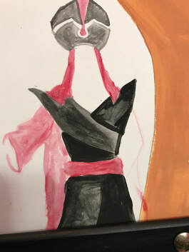
Once I finished my protagonist piece I began working on the antagonist. I did keep in mind to start with light colors, then work my way to the dark colors. I was able to get the clothing to look better as well as the overall proportions.
|
|
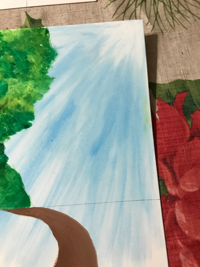
When working on the sky, I knew it had to be a very transparent blue to best resemble the sky. I mixed blue and white and plenty of water to get the consistency I wanted. I started in one direction and used a squared brush and did strokes diagonally. I added more water after each stroke to get a variety of shades. Towards the end I added white to the corners and continued in the direction of the blue. I then repeated this same process with the antagonist side. Instead of blue, I used black and white to resemble a dark stormy night.
|
|
|
|
The picture on the left is a progress check after working on it for the 4th time. The picture also shows where I struggled, in creating the same shade of brown for the sidewalk, because there was a darker layer underneath. The picture on the right is my progress after finishing the sky using black and white.
Experimentation
|
|
|
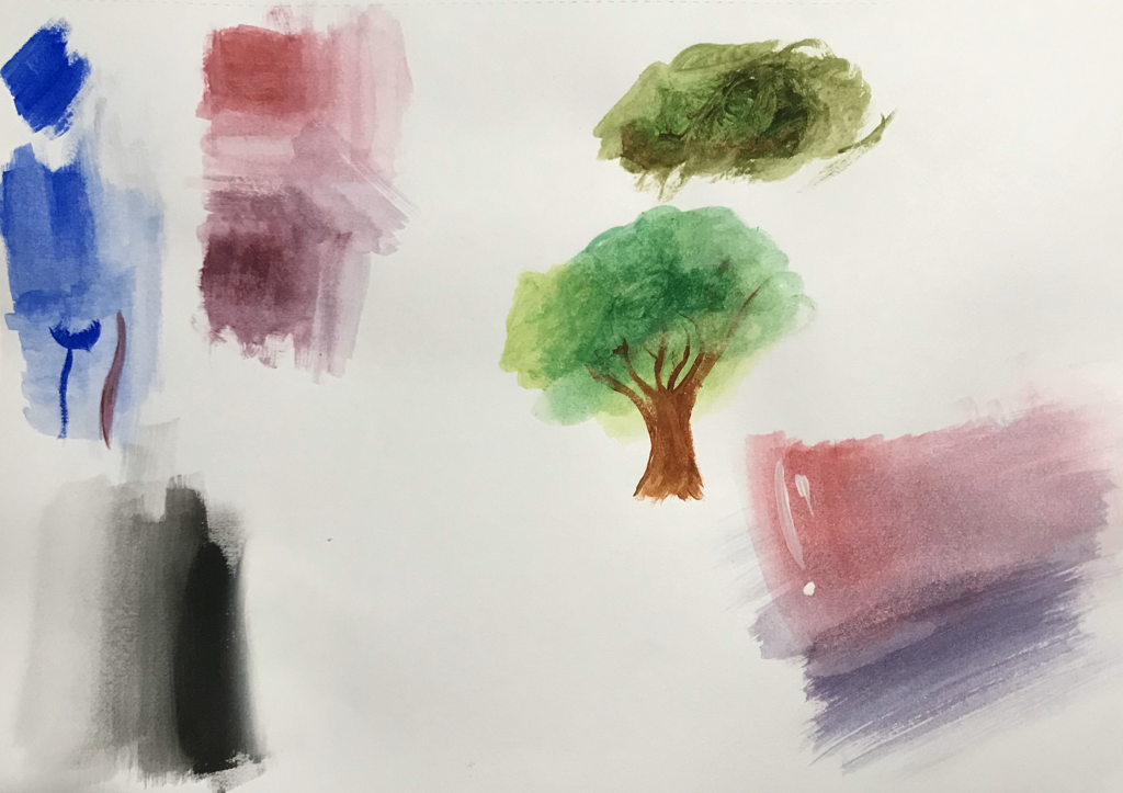
This was first time I worked with gouache paints. So before researching how it worked I wanted to get a feel of the paintings first. I randomly starting painting little shapes, because my work does have some fine details, especially faces. I did struggle a bit with the faces, so I decided to include extremely simple line work for some of the faces. I also tried shading colors, this was a challenge, because I notice how the colors would not combine but overlay with each other.
|
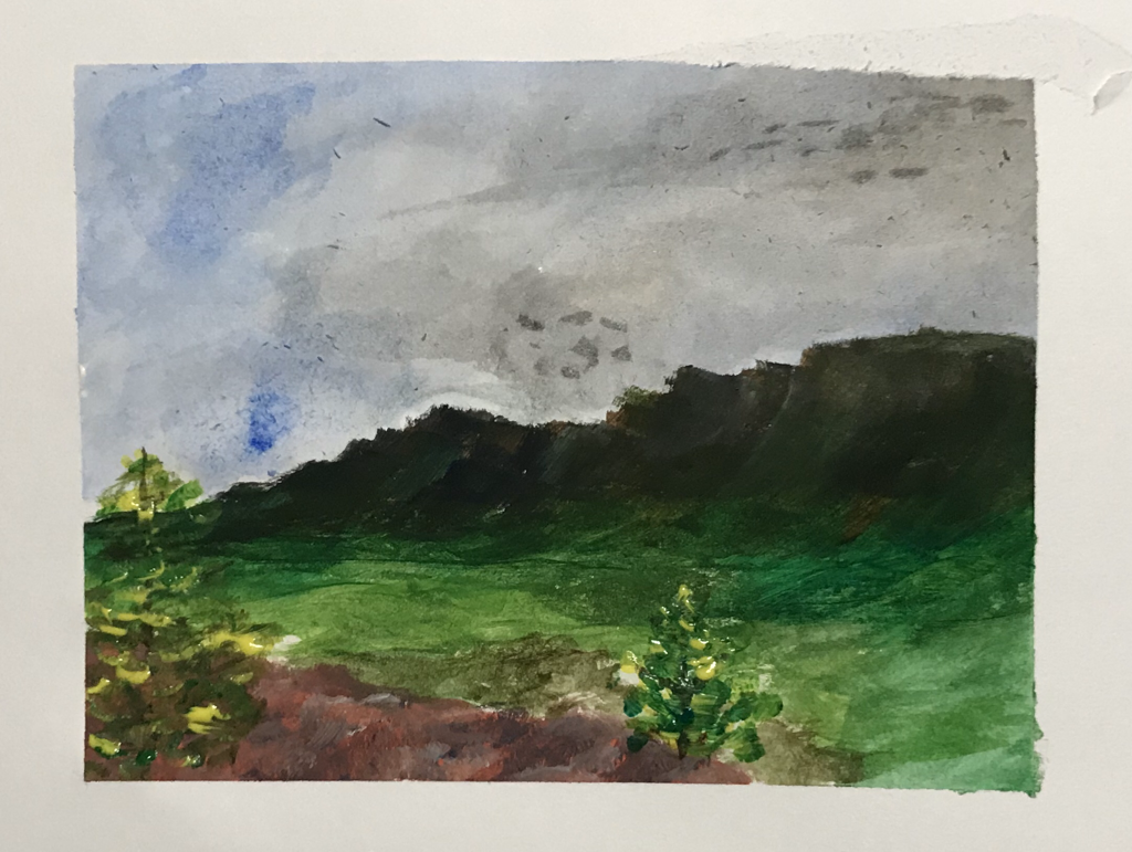
After looking at some videos and having a better understanding of the paints. I decided to make a quick landscape painting. This would help me understand how the paints overall look and how much water to use in certain sections. I learned I was able to start with the dark colors first and then continue on with my light colors.
|